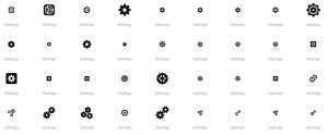
User Interface (UI) design has undergone significant transformations over the years. Central to this evolution is the iconography that guides users through various applications and systems. Among these icons, one of the most recognized and commonly used is the “settings” icon. This blog post will explore the evolution of settings icons in modern UI design, tracing their history, trends, and the underlying principles guiding their development.
The Origins of the Settings Icon
In the early days of computing, the user interface was text-based, with no graphical icons. As graphical user interfaces (GUIs) emerged, developers needed symbols to represent different functions. The settings icon, typically symbolizing a gear or cog, emerged as a representation of system configuration and adjustments. This iconography had roots in industrial settings, where gears are associated with machinery and engineering.
The Gear Icon. A Universal Symbol for Settings
The gear icon became the de facto symbol for settings due to its immediate recognition and simplicity. It was easy to understand and distinguishable from other icons. The simplicity and clarity of the gear made it an ideal choice for representing configuration and customization.
- Clarity Gears are inherently linked to machinery and technology, making them intuitive for users. This association with engineering reinforces the idea of system adjustments.
- Simplicity The gear icon is a simple design, often comprising a circle with spokes, making it visually distinct and easy to identify at a glance.
- Universality The gear icon has been widely adopted across different platforms and cultures, providing a universal language for settings and customization.
The Evolution of Icon Design
![]()
As UI design evolved, so did the aesthetics and styles of icons. The settings icon followed these trends, reflecting the broader changes in design principles.
Skeuomorphism to Flat Design
Skeuomorphism was a dominant design trend in the early 2000s, where icons and elements mimicked real-world objects with detailed textures and shadows. The settings icon during this period often had a three-dimensional appearance, with beveled edges and shadows giving it depth.
In the 2010s, flat design gained popularity. This style focused on simplicity, using solid colors and avoiding gradients and shadows. The settings icon in this era became flatter, with fewer details but a more streamlined appearance.
Material Design and Beyond
Material Design, introduced by Google in 2014, further refined flat design with a focus on depth, motion, and bold colors. The settings icon in Material Design had a minimalist look, often rendered in a single color with subtle shadows to create a sense of layering and hierarchy.
The trend toward minimalist design continued, with many modern UIs adopting a clean and simple look. The settings icon reflected this trend, becoming less intricate but maintaining its recognizability.
The Rise of Customization and Adaptability
As user interfaces became more dynamic and customizable, the settings icon evolved to accommodate these changes. Modern UIs often allow users to personalize their experiences, from changing themes to adjusting system behavior. The settings icon became a gateway to these customization options.
Icon Variants and Contextualization
In modern UI design, the settings icon is not limited to a single representation. Depending on the context, designers have created variations of the settings icon to represent specific functions. For example.
- General Settings The traditional gear icon, indicating general system settings.
- Advanced Settings A more intricate gear icon or a combination of gears, indicating deeper configuration options.
- User Settings A gear icon combined with a user profile or silhouette, indicating user-specific settings.
These variants allow designers to maintain a consistent theme while providing additional context to users.
Adaptive and Responsive Design
With the proliferation of devices, from smartphones to tablets to desktop computers, responsive design became crucial. The settings icon adapted to different screen sizes and orientations, ensuring it remained legible and accessible. In responsive design, the settings icon might change in size, color, or position based on the device, but its core design remained consistent.
Accessibility and Inclusivity in Settings Icons

Modern UI design places a strong emphasis on accessibility and inclusivity. The settings icon, like all icons, must be accessible to users with varying abilities and needs.
Color Contrast and Visibility
To ensure accessibility, designers focus on color contrast and visibility. The settings icon is often rendered in high-contrast colors to ensure it is easily distinguishable from the background. This approach is crucial for users with visual impairments.
Alternative Text and Screen Readers
For users who rely on screen readers, alternative text descriptions are essential. The settings icon should have clear and concise alternative text, allowing screen readers to accurately convey its purpose.
Touch-Friendly Design
With the rise of touch-based devices, the settings icon must be designed for touch interactions. This consideration involves making the icon large enough to tap and providing sufficient spacing to prevent accidental touches.
The Future of Settings Icons
As technology continues to evolve, the role of the settings icon will likely expand. Emerging technologies, such as augmented reality (AR) and virtual reality (VR), will require new approaches to UI design. The settings icon may take on new forms, incorporating three-dimensional elements or interactive features.
Furthermore, the trend toward personalization and customization will continue to drive innovation in settings icon design. Users will expect more control over their experiences, and the settings icon will serve as the gateway to these features.
Conclusion
The settings icon has evolved significantly over the years, reflecting broader trends in UI design. From its origins as a simple gear symbol to its current role as a customizable and adaptive element, the settings icon remains a crucial part of modern UIs. As technology advances, the settings icon will continue to adapt, providing users with a clear and accessible way to configure and personalize their experiences.